Collaborated on the end-to-end design of EyePromise, a unified digital experience for patients and eye care professionals.
Collaborated on the end-to-end design of EyePromise, a unified digital experience for patients and eye care professionals.
Collaborated on the end-to-end design of EyePromise, a unified digital experience for patients and eye care professionals.
To comply with my non-disclosure agreement, certain project details have been omitted or generalized. The work presented reflects my role and contributions to the project.
To comply with my non-disclosure agreement, certain project details have been omitted or generalized. The work presented reflects my role and contributions to the project.
Outcome
• Built a lo-fi 49-component design system
• Designed 40+ low-fidelity UX wireframe pages
• Curated 250+ media assets across 50+ pages
• Created 50+ logo explorations
• Designed responsive infographics across breakpoints
Outcome
• Built a lo-fi 49-component design system
• Designed 40+ low-fidelity UX wireframe pages
• Curated 250+ media assets across 50+ pages
• Created 50+ logo explorations
• Designed responsive infographics across breakpoints
Outcome
• Built a lo-fi 49-component design system
• Designed 40+ low-fidelity UX wireframe pages
• Curated 250+ media assets across 50+ pages
• Created 50+ logo explorations
• Designed responsive infographics across breakpoints
OVERVIEW
Sector
Sector
Healthcare
E-commerce
Healthcare
E-commerce
Role
Role
UX/UI Designer
Graphic Designer
UX/UI Designer
Graphic Designer
Contribution
Contribution
Research
UX Design
UI Design
Infographics
Brand Identity
Photoshop
Stakeholder
Alignment
Collaboration
Research
UX Design
UI Design
Infographics
Brand Identity
Photoshop
Stakeholder
Alignment
Collaboration
Timeline
Timeline
9 months
9 months
Sector
Healthcare
E-commerce
Contributions
Research
UX Design
UI Design
Infographics
Brand Identity
Photoshop
Stakeholder
Alignment
Collaboration
Role
UX/UI Designer
Graphic Design
Timeline
9 months
HIGHLIGHTS


STARTING POINT
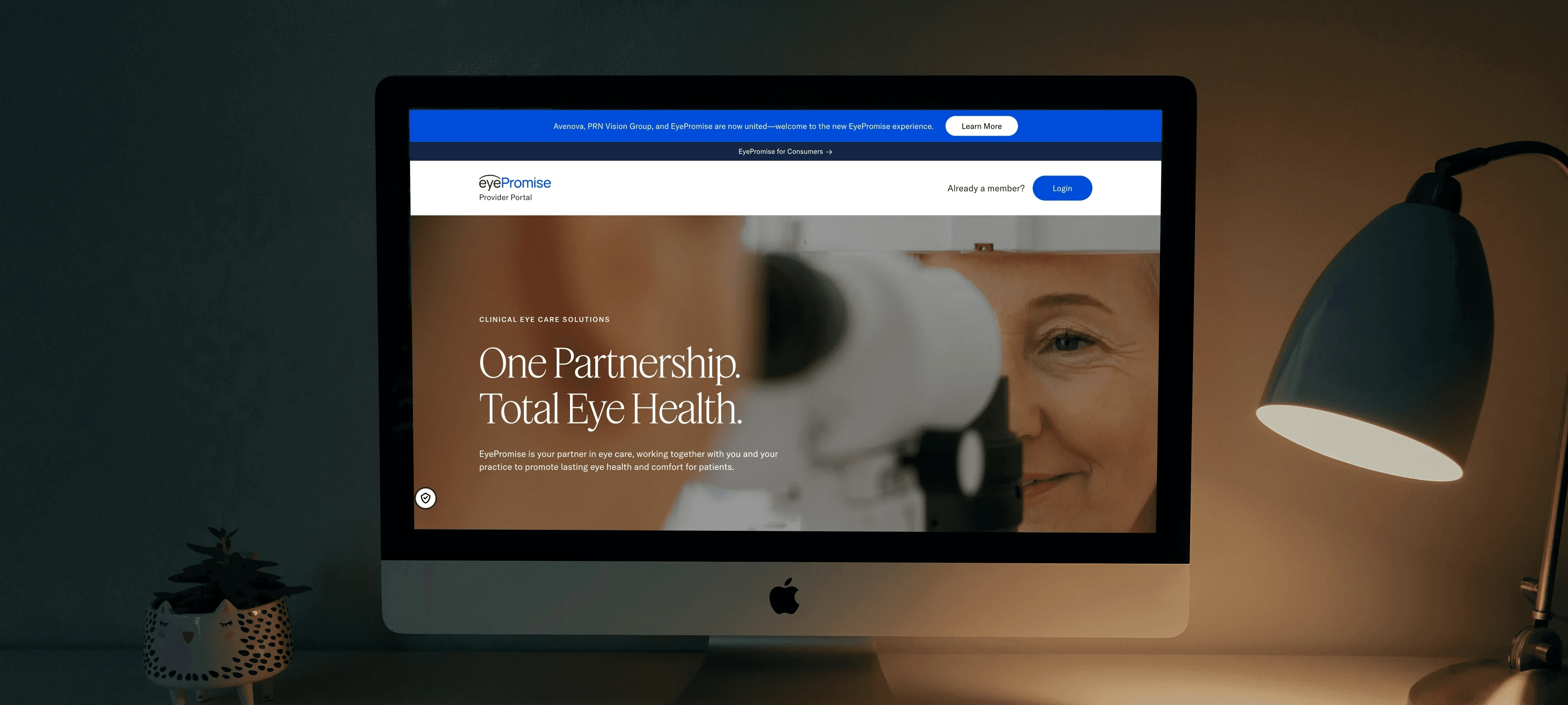
EyePromise needed a unified digital platform that could bring together its brand, products, educational resources, and provider tools into a cohesive experience.
The goal was to improve access to eye health products for patients while supporting stronger connections with eye care professionals.
Beginning in Spring 2025, I joined the Alice design team as an intern and later moved into freelance. I collaborated with designers, developers, strategists, and project managers across multiple phases of the project.
My role focused on ideation, rapid concept development, and translating ideas into thoughtful design solutions. I contributed across the design process—from early competitor research and brand exploration to responsive UX design, media curation, and interface refinement leading up to the platform’s launch in February 2026.


RESEARCH AND COMPETITIVE LANDSCAPE
To understand the eye care landscape, our team analyzed competitor brands and adjacent health and wellness platforms. Working with Chief Design Officer Paul Woods, we reviewed how companies positioned their products, communicated scientific credibility, and structured their digital experiences.
We found that many competitors emphasized individual product branding while placing less focus on a cohesive brand experience. This revealed an opportunity for EyePromise to stand out through a more unified brand and platform.
These insights informed early brand exploration and helped guide stakeholder discussions around the visual and product direction of the new platform.


LOGO SPRINT
Building on the research insights, we moved into rapid exploration of the EyePromise visual identity. Working with the Design Lead, Tina Chan, we generated over 50 logo concepts each through quick sketching and digital iterations.
We explored a range of custom wordmarks, symbols, and stacked variations to test how the identity could scale across different brand applications.
Concepts were compiled into internal presentation decks and reviewed with the CDO, PM, and broader design team to gather feedback and align on direction.
Through several rounds of refinement, the strongest concept emerged and was developed into the final EyePromise wordmark and symbol.
Building on the research insights, we moved into rapid exploration of the EyePromise visual identity. Working with the Design Lead, Tina Chan, we generated over 50 logo concepts each through quick sketching and digital iterations.
We explored a range of custom wordmarks, symbols, and stacked variations to test how the identity could scale across different brand applications.
Concepts were compiled into internal presentation decks and reviewed with the CDO, PM, and broader design team to gather feedback and align on direction.
Through several rounds of refinement, the strongest concept emerged and was developed into the final EyePromise word mark and symbol.
Building on the research insights, we moved into rapid exploration of the EyePromise visual identity. Working with the Design Lead, Tina Chan, we generated over 50 logo concepts each through quick sketching and digital iterations.
We explored a range of custom wordmarks, symbols, and stacked variations to test how the identity could scale across different brand applications.
Concepts were compiled into internal presentation decks and reviewed with the CDO, PM, and broader design team to gather feedback and align on direction.
Through several rounds of refinement, the strongest concept emerged and was developed into the final EyePromise wordmark and symbol.


DESIGN FOUNDATIONS
Following the logo exploration phase, I collaborated closely with UX Strategist Jens Rauenbusch and led the UX design, focusing on work that supported the approval of page content strategy.
To establish a clear starting point for the interface, I defined early design tokens including typography styles, neutral grayscale values, and layout rules. These foundations allowed the team to focus on content structure and information hierarchy without the distraction of high-fidelity visuals.
This approach enabled productive stakeholder and client conversations through low-fidelity work, helping teams review page structure, align on content, and secure approvals before moving into the UI design phase.


UX WIREFRAMES & COMPONENT LIBRARY
With these foundations in place, I developed over 40 low-fidelity UX wireframe pages across both the eye care provider portal and the consumer-facing ecommerce experience. These wireframes mapped page layouts, content hierarchy, and user flows and were used in internal and external client-facing meetings to review structure and finalize page content.
As patterns began to repeat across pages, I built a reusable component library to standardize design across the platform. Using an atomic design structure, I defined atoms such as buttons, filters, and inputs; molecules including product cards, content cards, headers, and media modules; and organisms that formed larger templates such as product grids, content grids, banners, CTAs, reviews, accordions, data tables, and checkout flows.
These components were compiled into internal presentation decks and reviewed with the internal team to gather feedback and align on direction.
This approach allowed us to develop both provider and consumer experiences simultaneously, resulting in a 49-component design system that improved iteration, ensured consistency across journeys, and supported clearer stakeholder discussions around page structure and content approvals.


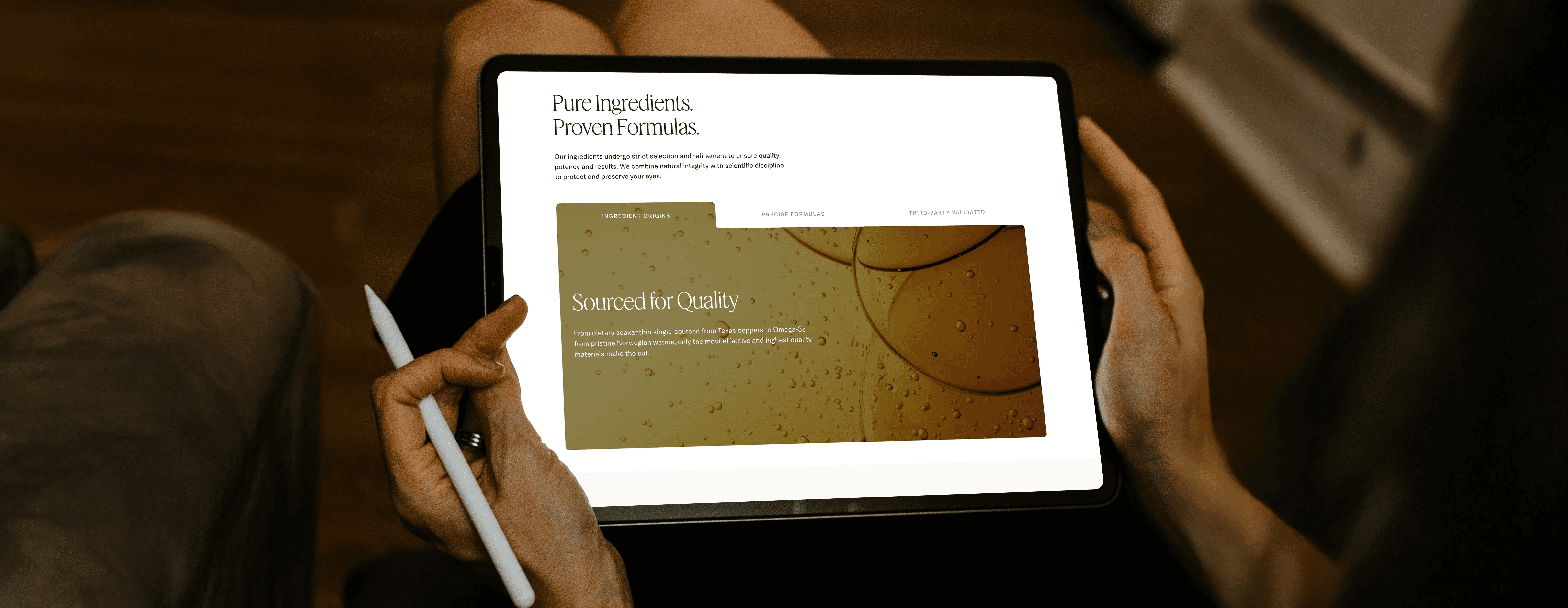
MEDIA CURATION
With the platform structure and components established, I curated visual media to support the content strategy across more than 50 pages and articles.
I sourced over 250 images for specific modules, sections, and page headers, ensuring each visual aligned with the brand’s visual direction and storytelling approach. For each section, I prepared multiple alternatives so the team could review options during internal discussions and refine selections before presenting them externally.
All imagery followed the established brand guidelines. After approval, I prepared licensed assets for implementation—exporting the correct sizes, applying Photoshop refinements when needed, and replacing placeholders in Figma with finalized images.


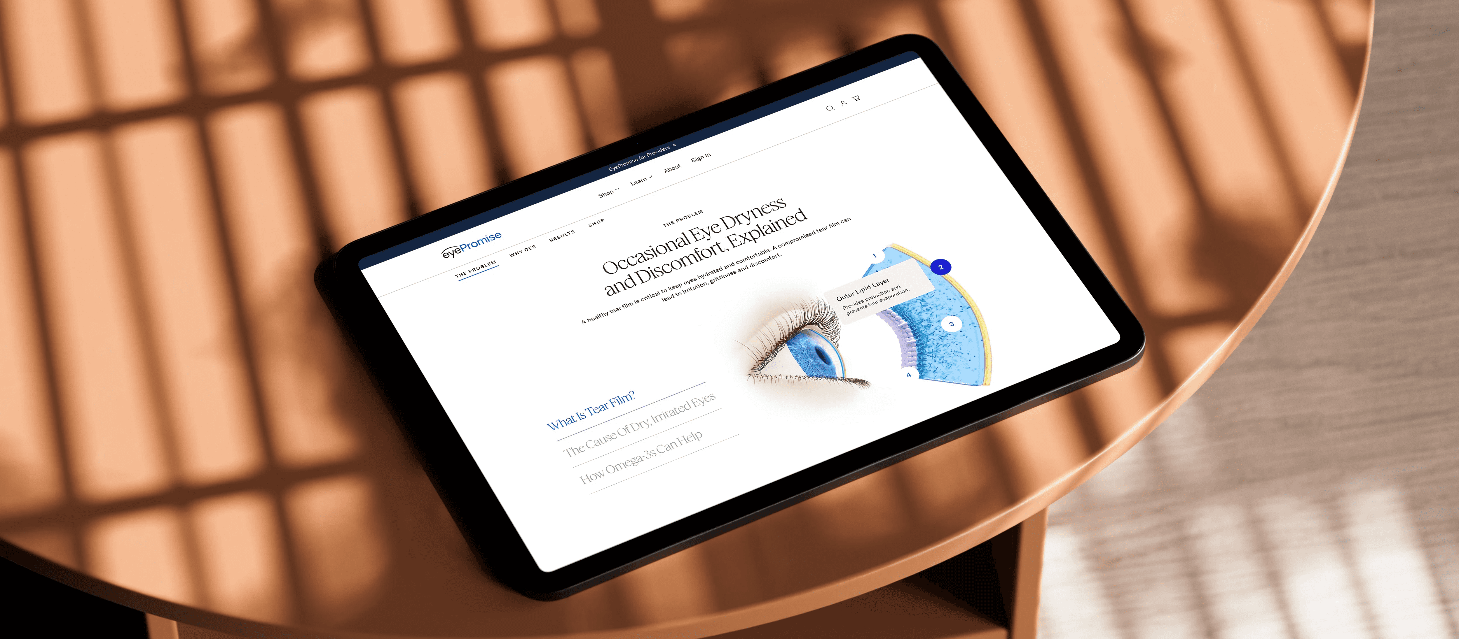
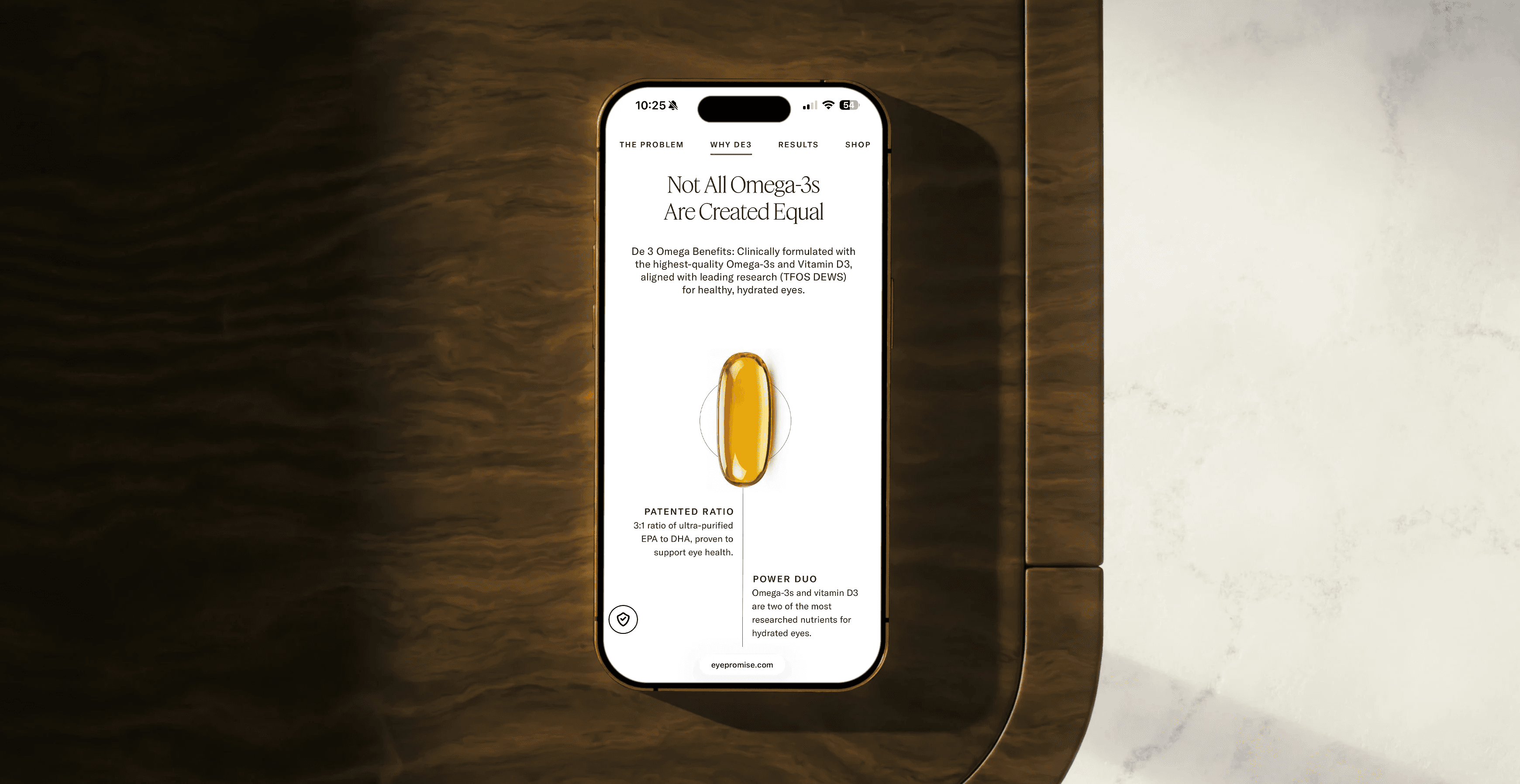
INFOGRAPHICS
To support the platform’s educational content, I worked on a series of infographics that visualized research and technical information.
These included line charts, bar charts, and data tables adapted for desktop, tablet, and mobile layouts to maintain readability across breakpoints.
I collaborated with Project Manager Nicole Leighton to review progress, gather team feedback, and iterate as sections were completed and prepared for presentations.
REFLECTING ON THE EXPERIENCE
EyePromise successfully launched at the end of February 2026!
I’m grateful to have been part of the project from start to finish and to have worked alongside so many talented individuals. I began the project as an intern and later continued contributing as a freelance designer. The opportunity to work with a highly collaborative, cross-functional team has shaped the way I move through design sprints, weigh different perspectives, iterate and prioritize needs.
Working closely with different teams, I saw how many moving parts come together to launch a large-scale digital product. I’m thankful for the mentorship, feedback, and trust the team gave me throughout the process.